ROLE: UX Research, UX Design
DURATION: Dic 2022 – Giu 2023
Progetto
La Placette è un bellissimo hotel ristorante a conduzione familiare nato quarant’anni fa a Usseaux, in Val Chisone, Italia.
Come UX designer, per loro ho studiato una soluzione per enfatizzare i quattro aspetti della loro attività: hotel, affitta appartamenti, ristorante e SPA.
Come sviluppatore ho creato l’interfaccia utente, ottimizzato la SEO aumentando così visitatori e clienti.
I problemi
- 4 attività: La Placette non è solo un albergo diffuso ma anche un affitta appartamenti, un ristorante e una piccola spa. Uno dei problemi era quindi mostrare all’utente tutte le attività della struttura appena entrati nel sito senza creare confusione.
- Interfaccia utente obsoleta: il loro sito era molto datato e presentava diversi bug. Il problema era modernizzare l’interfaccia rendendola di facile comprensione e più accessibile a qualsiasi tipo di utente.
- Scarsa produttività: il vecchio sito era poco visitato anche a causa della scarsa attenzione alla SEO e ad un sbagliata collocazione nel mercato.
Gli obiettivi
- Enfatizzare le 4 attività, trovando un modo per mostrarle nella home page dandogli lo stesso peso e importanza.
- Modernizzare la UI, rendendola al passo coi tempi, accattivante e facile da usare.
- Aumentare i lead, facendo ricerche i mercato per trovare i punti forti della loro offerta e ottimizzando foto e testi per la SEO.
Ruolo e responsabilità
In questo progetto il mio ruolo è stato quello di UX designer, ricercatore e sviluppatore.
Le mie responsabiltà erano…
Condurre:
- studi sull’usabilità
- approfondimenti
- studi sull’accessibilità
Elaborare:
- empathy maps
- personas
- journey map
- personal and hypothesis statements
Disegnare:
- paper wireframes
- digital wireframes
- low-fidelity prototypes
- mockups
- high-fidelity prototype
Produrre:
- un sito web responsive
- un’ottimizzazione della SEO
- una back end per il cliente, facile da utilizzare per l’aggiornamento dei dati in autonomia
Capire l'utente
Per prima cosa ho condotto una competitive audit tra i diversi operatori che propongono lo stesso tipo di offerta a livello locale e in un raggio di 100 km.
Da questa ricerca è emerso che poche altre aziende offrono gli stessi servizi e il modo in cui lo pubblicizzano è scarso.
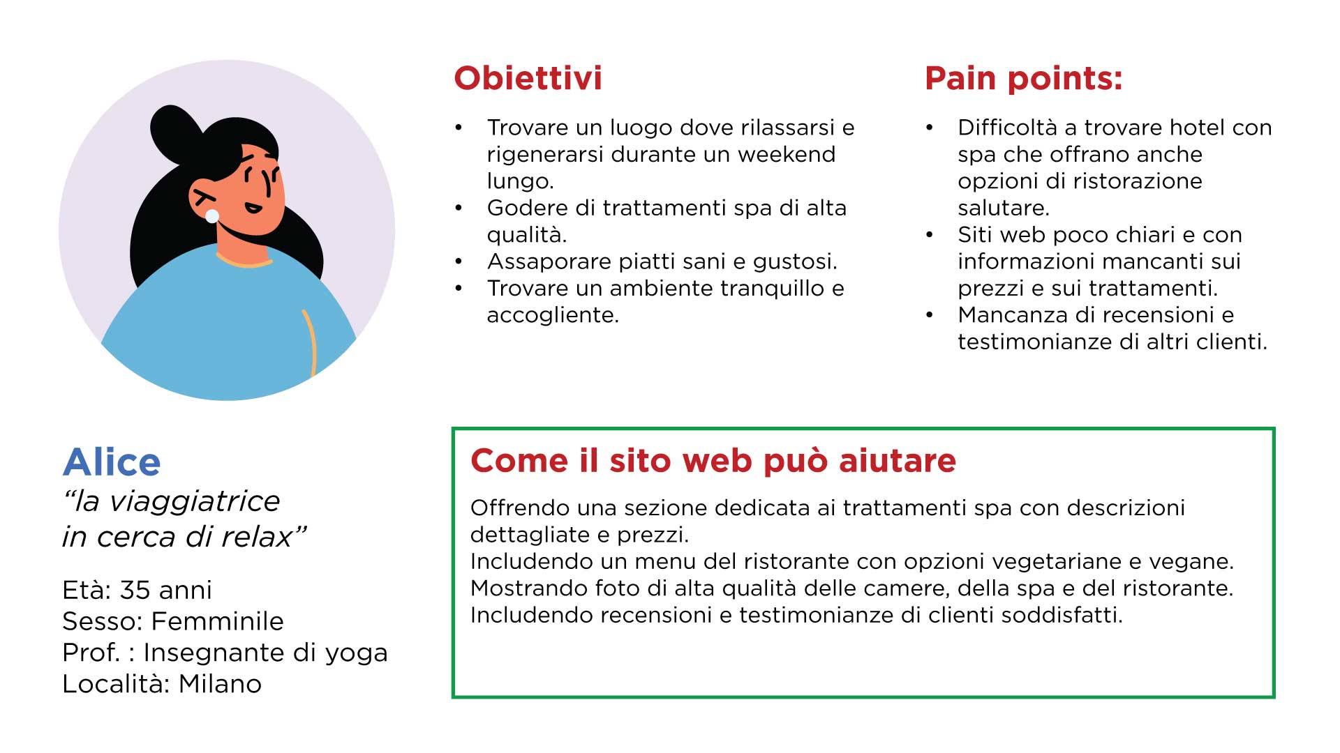
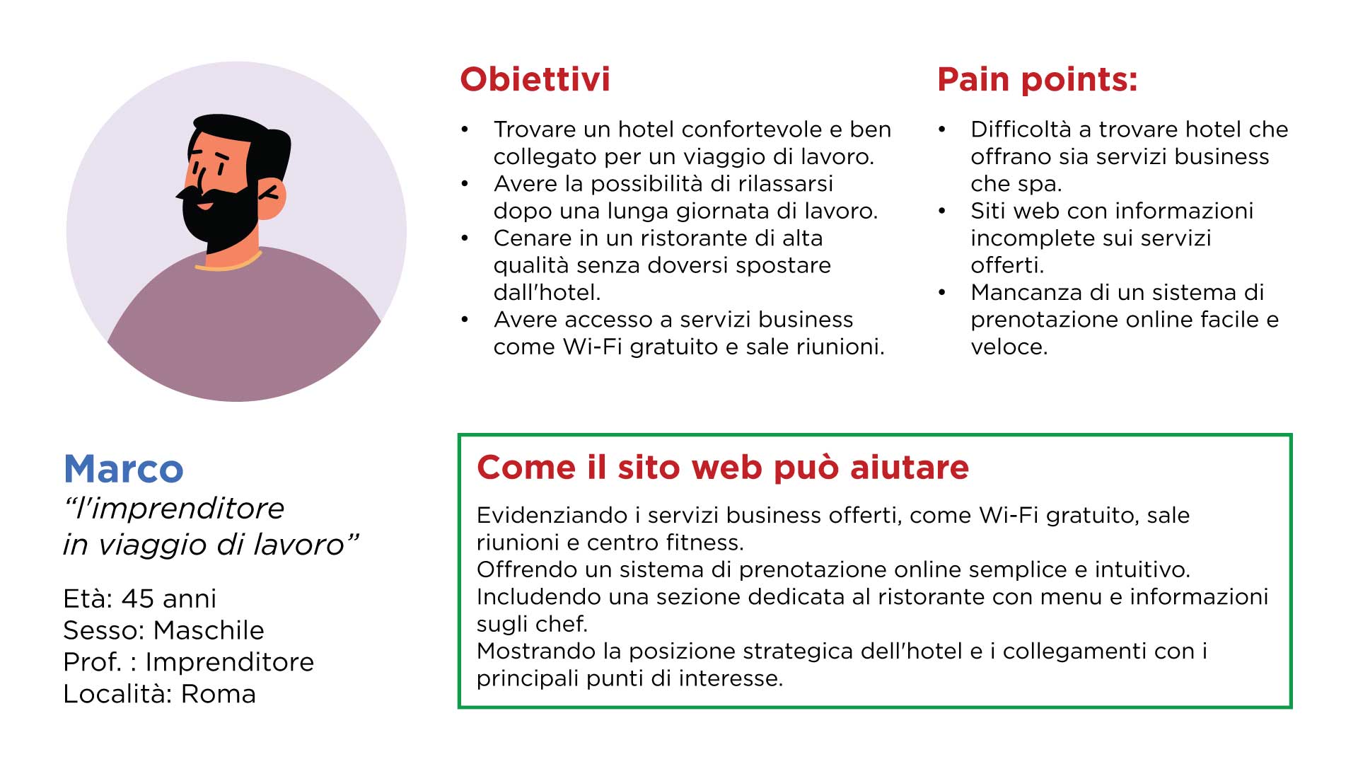
Ho creato due tipi differenti di personas (utente tipo) in base alle loro esigenze, età e gap tecnologici.
Punti dolenti
Difficoltà a trovare informazioni: gli utenti potrebbero avere difficoltà a trovare le informazioni che cercano, come i prezzi, gli orari di apertura, i menu del ristorante o i trattamenti della spa. Questo può portare a frustrazione e abbandono del sito.
Esperienza utente non ottimale: un sito web difficile da navigare o con un processo di prenotazione complicato può scoraggiare i clienti. È importante che il sito web sia facile da usare e intuitivo.
Mancanza di ottimizzazione per i motori di ricerca: se il sito web non è ottimizzato per i motori di ricerca, sarà difficile per i potenziali clienti trovarlo online. È importante utilizzare le giuste parole chiave e tecniche SEO per migliorare il posizionamento del sito web nei risultati di ricerca.
Personas
Ho cercato di immaginare due tipi di clienti che potrebbero essere interessati all’app, scelti in base all’età media, agli interessi e a diverse tipologie di problematiche.
Marco
"L'imprenditore in viaggio"
Marco è un imprenditore che per viaggio dovrà andare nella Val D’Aosta ma ha difficoltà a trovare un hotel che offra servizi per lui essenziali.
Competitive audit
The goal of this audit was to understand how other competitors try to collect donations, how they help the user to do it without issues and how we can improve the user experience.
Simplifying the donation and adoption process was the main goal.
Ideation
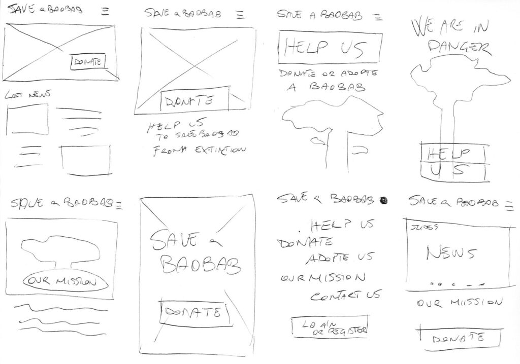
With the crazy eights method, I tried to figure out how to arrange the main elements on the homepage of the app.
The donate button was at the top of the priority list.
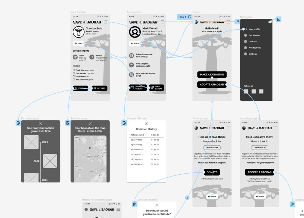
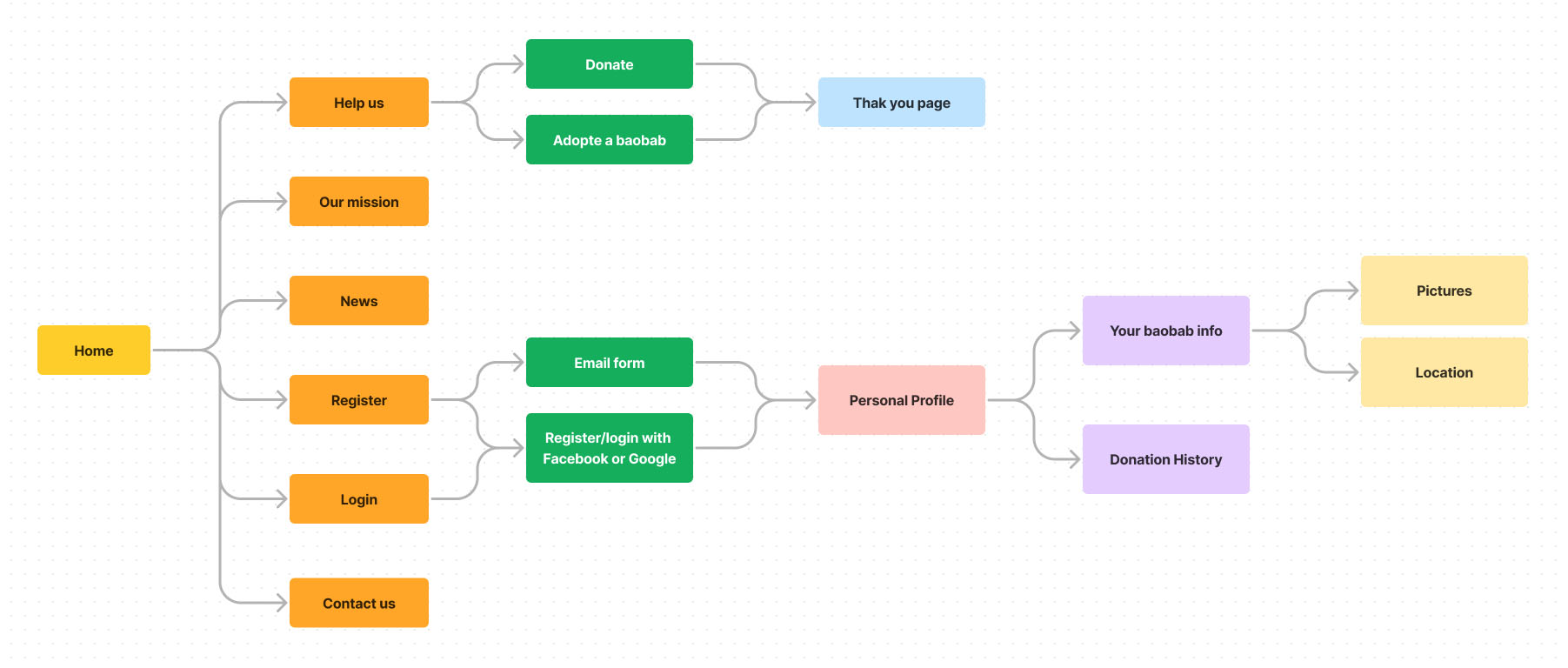
User flow map
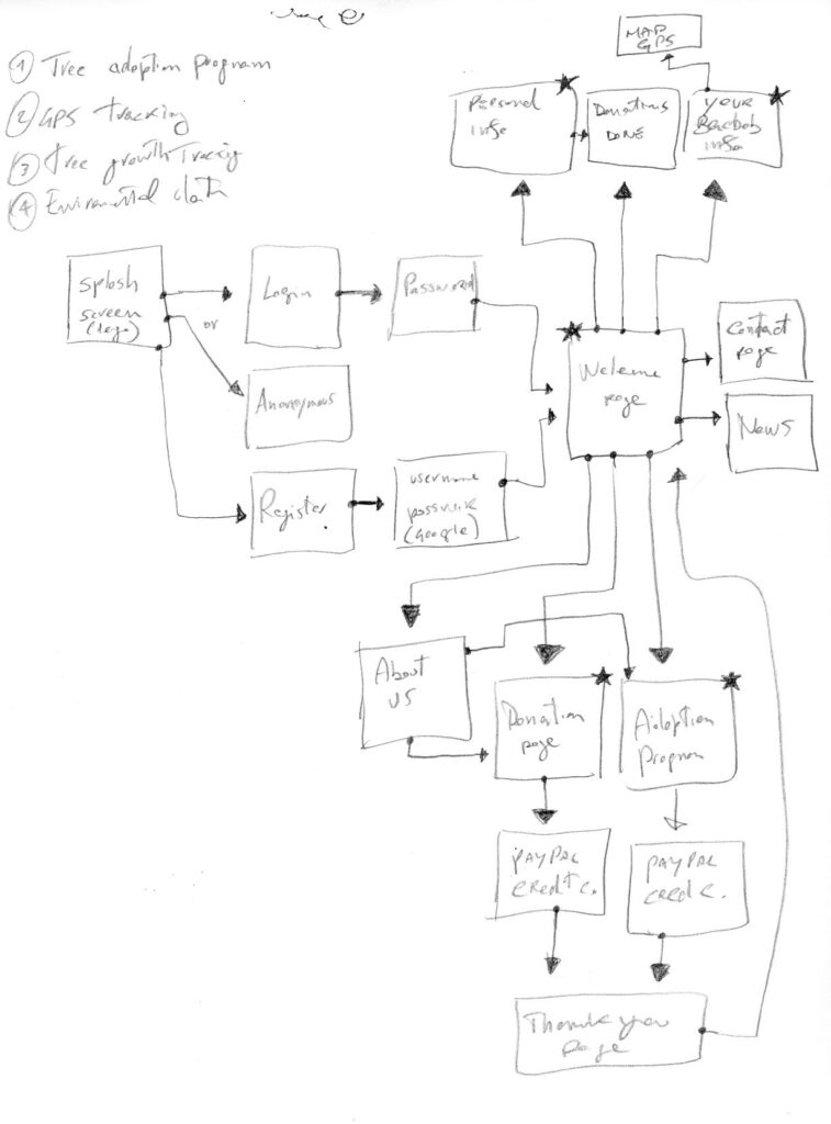
First I started creating a user flow map trying to figure out how the user could navigate the app.
Thanks to this, I found out that I could implement useful things like GPS tracking for adopted trees and health information about them.
Preliminary paper wireframes
Before to start designing on Figma I
preferred to sketch some ideas on paper.
I found different ways to put in evidence the main goals of the app: donations to the project and tree adoptions.
Low fidelity wireframes
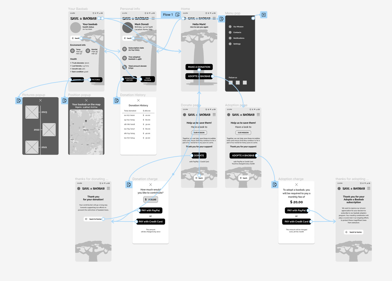
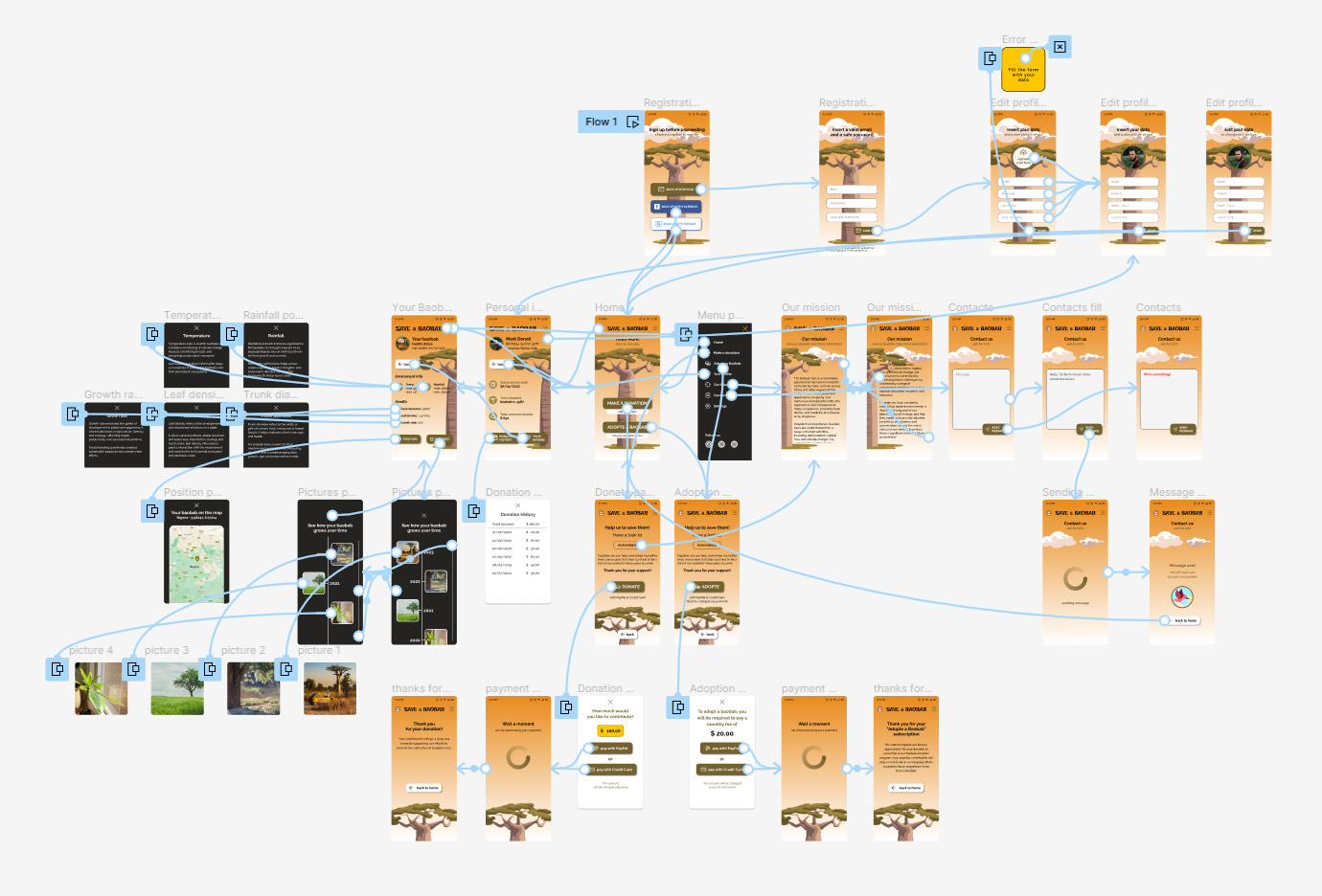
1 – I started to design the homepage of the app putting in evidence the Donations and the Adopt button.
On the top, a welcome message to the registered user.
2 – The personal page has to contain all the info about donations and adoption.
I included also a “back” button to simplify the user flow.
3 – The page of the adopted
baobab had to contain all info about the environment where it grows up and info about its health status.
I also included a button for the GPS position page and a button for the picture gallery history of the tree.
First Usability study
Research goal: understand if is easy to donate or adopt a baobab with the app and if personal and tree info are easy to consult.
Research questions:
- Is it easy to donate?
- Is easy to adopt a baobab?
- Are there issues to understand info about tree?
- Are there any parts where users are getting stuck?
KPI’s:
- Time on task: to check how is easy to donate or adopt a baobab
- Drop-off rate: to check if there are any parts where users get stuck
- Conversion rate: to check if users are able to donate or adopt
Study type
Moderated live interviews
Partecipants
Two males, two females, and one person with disabilities between the ages of 20 and 50.
Two participants are persons who don’t speak english.
Location
Rome. In a quiet room.
Lenght
1 day
Results
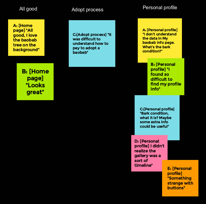
After the usability study, I found out that find the personal info page was not easy find, enviroment and other info about tree were not easy to understand and that a better iconography should help to use the app.
Here is my affinity diagram where is easy to observe that:
- Users want to easily donate
- Users want to easily adopt a baobab
- Users want to understand the meaning of some info on the adopted tree page
- Users want to find out how to change personal info
Low fidelity prototype 2
Basing on the usability study I implemented iconography to give a better experience to the user.
I also included the possibility to click on the tree’s info to let the user understand what is reading.
Mock-up
Time to make the first mockup.
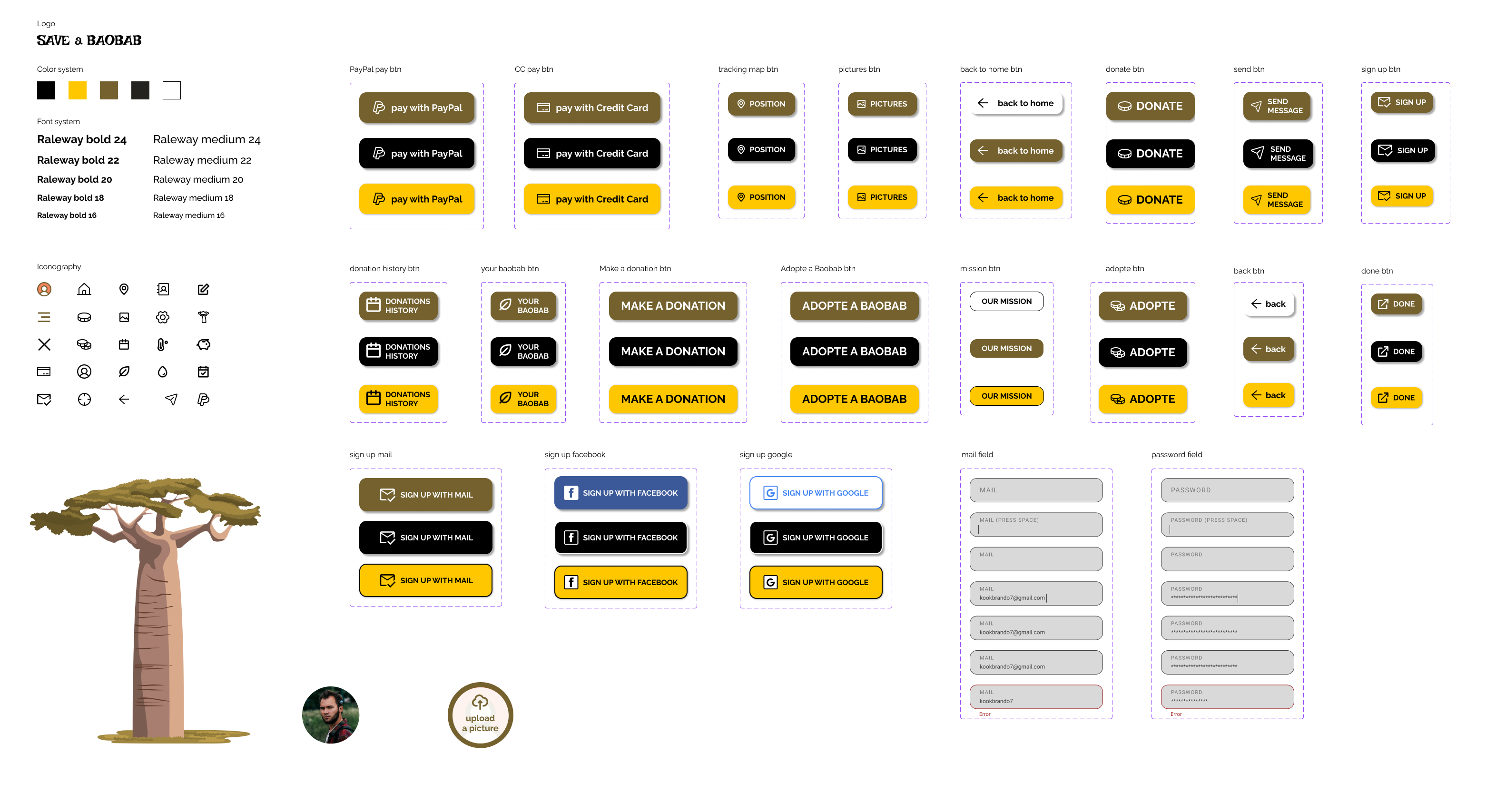
I set the 3 primary colours.
I applied the 60-30-10 rule for colors.
60% with Orange (#E98B1C)
I used it for the background.
30% with Green (#74612E)
For main buttons.
10% with Black (#00000)
For page titles, call to actions, brand identity and body.
2 types of font. Raleway bold for titles and Raleway medium for body and placeholders.
Choose a set of icons for menus, buttons and forms.
Choose the the style for buttons and input areas.
Second Usability study
Research goal: understand if the app now solves the issue it has before and check if there are new things to be fixed or improved.
Research questions:
- Is it easy to donate or adopt?
- Is it easy to find personal info?
- Is the meaning of the tree’s info clear now?
- Is the Gallery understandable?
- Are there any parts where users are getting stuck?
KPI’s:
- Time on task: to check how is easy to donate or adopt and how long it takes
- System usability scale: to check if the design can be improved
- Conversion rate: to check if users are able to donate or adopt
Study type
Moderated live interviews
Partecipants
Two males, two females, and one person with disabilities between the ages of 20 and 50.
Two participants are persons who don’t speak English.
Location
Rome. In a quiet room.
Lenght
1 day
Results
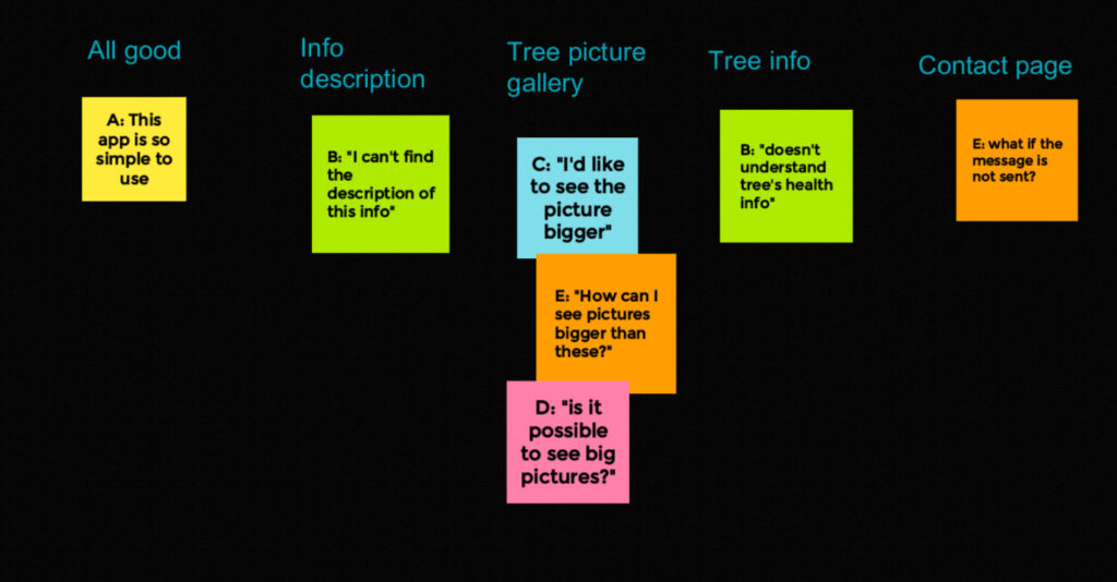
After the usability study, I found out that some participants would like to see gallery pictures bigger and someone still doesn’t understand tree’s health info.
So I decided to implement a pop-up for each picture of the gallery to see them bigger and popups for each health info to explain, with a simple description, the meaning of that info.
The SUS questions reported that all the information and, in general, the design is clear and easy to use.
High-fidelity prototype
In the hi-fi prototype, I included all the possible user choices and optimize the flow based on a third usability test.
In this case, I also provided to design the signup and the sign-in process.
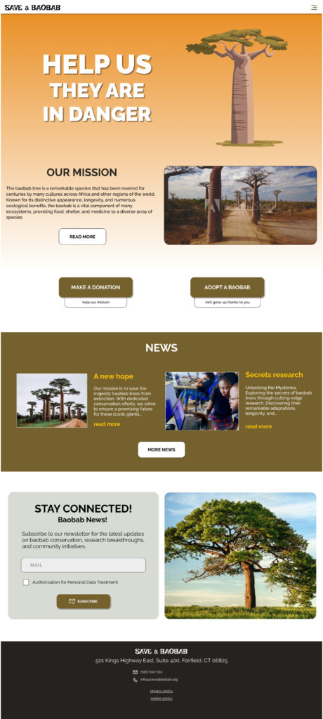
Responsive website
Website sitemap
For the responsive website, the goal was to maintain the same consistency of the app adding some new features for the different devices, like the news section.
Responsive designs
The website version of the app should be visible and efficient over all devices.
I tried to maintain the same consistency of the app giving accent on the main goals: donations and adoptions.
mobile version
tablet version
desktop version
Takeaways
Impact
Users praise the app and website for their user-friendly design, making donations or adopting baobabs effortlessly achievable.
They also note that it instils a sense of empowerment, making environmental contributions accessible to all.
What I learned
Working for social good was special. I felt so helpful with this project. I would love to work on similar purposes in the future.
I learned how demanding is to design apps and responsive websites, and at the same time, how is satisfying.
Next steps
1
Research how successful the app is in reaching the goal of saving baobabs.
2
Implementing more languages to let more users around the world help these wonderful trees.
3
Give some rewards to the best users to give others an example to follow.