PROJECT Save a Baobab app and responsive website

ROLE: Visual, UX Research, UX Design

DURATION: Dec 2022 - Jun 2023

Project vision

Save a Baobab” is an innovative crowdfunding platform dedicated to preserving the iconic Baobab trees in Nigeria, Africa. 
This initiative harnesses the power of user experience (UX) design to connect individuals with the opportunity to adopt and support these ancient symbols of resilience and heritage.

The problem

  • Clarity in Adoption Process: Clearly communicating the adoption process and its steps could be difficult. Users should understand how their adoption contributes to the cause and what they can expect after adoption. Overloading users with information or unclear instructions may lead to frustration and drop-offs.

  • Donation Process: Designing a seamless and trustworthy donation process is critical. Users might hesitate if they perceive any ambiguity in the donation process, leading to abandoned carts or mistrust of the platform.

  • Accessibility: Ensuring that the app is accessible to all users, including those with disabilities, requires extra attention. Designing features that cater to a diverse range of abilities and ensuring compatibility with assistive technologies can be complex.

The goal

  • Baobab Conservation: The app aims to raise awareness about the importance of Baobab tree preservation. It seeks to encourage users to take an active role in conserving these iconic trees, which are not only essential to the ecosystem but also hold cultural significance.

  • Donations and Funding: The primary objective is to raise funds through user donations. These funds are used to support conservation efforts, including planting and nurturing Baobab trees, implementing conservation projects, and supporting local communities.

  • Impact Measurement: The app seeks to measure and showcase the impact of users’ contributions. This includes metrics such as the number of adopted trees, the increase in Baobab populations, and the positive effects on local communities and ecosystems.

Role and responsabilities

In this project my role was UX designer and researcher.

My responsabilities were:

Conduct:

  • usability studies
  • insights
  • accessibility studies

Write down:

  • empathy maps
  • personas
  • journey map
  • personal and hypothesis statements

Design:

  • paper wireframes
  • digital wireframes
  • low-fidelity prototypes
  • mockups
  • high-fidelity prototype

Understanding the user

I have conducted a competitive audit between different companies who try to reach the same goal: save species, plants or animals, from extinction.

From the audit emerged that some of their website or app are not optimized to be inclusive and accessible, some of them have just one language option or is difficult to understand how to contribute.

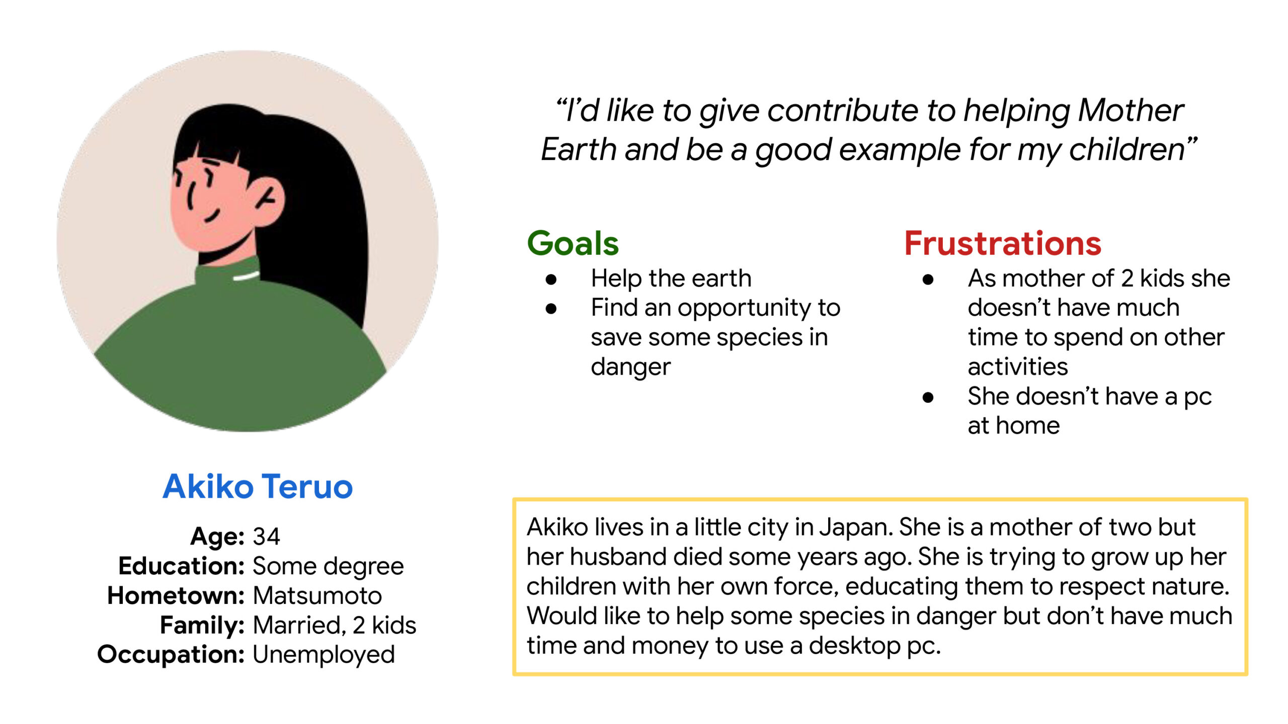
I made 2 different personas based on their needs, technology access, and age gaps.

Pain points

  • Complex Adoption Process: If the adoption process is too complex or requires excessive information from users, it might discourage them from completing the adoption. Simplifying the process and providing clear guidance can mitigate this pain point.

  • Lack of Clear Information: If users don’t find comprehensive information about the purpose of the app, the conservation efforts, or how their donations will be used, they might hesitate to participate. Providing transparent and concise information is crucial.

  • Lack of Impact Measurement: Without clear indicators of how users’ contributions make a difference, they may question the app’s effectiveness, leading to a lack of motivation for continued participation.

Personas

I tried to imagine two types of customers who might be interested in the app, chosen by average age, interests and different types of issues.

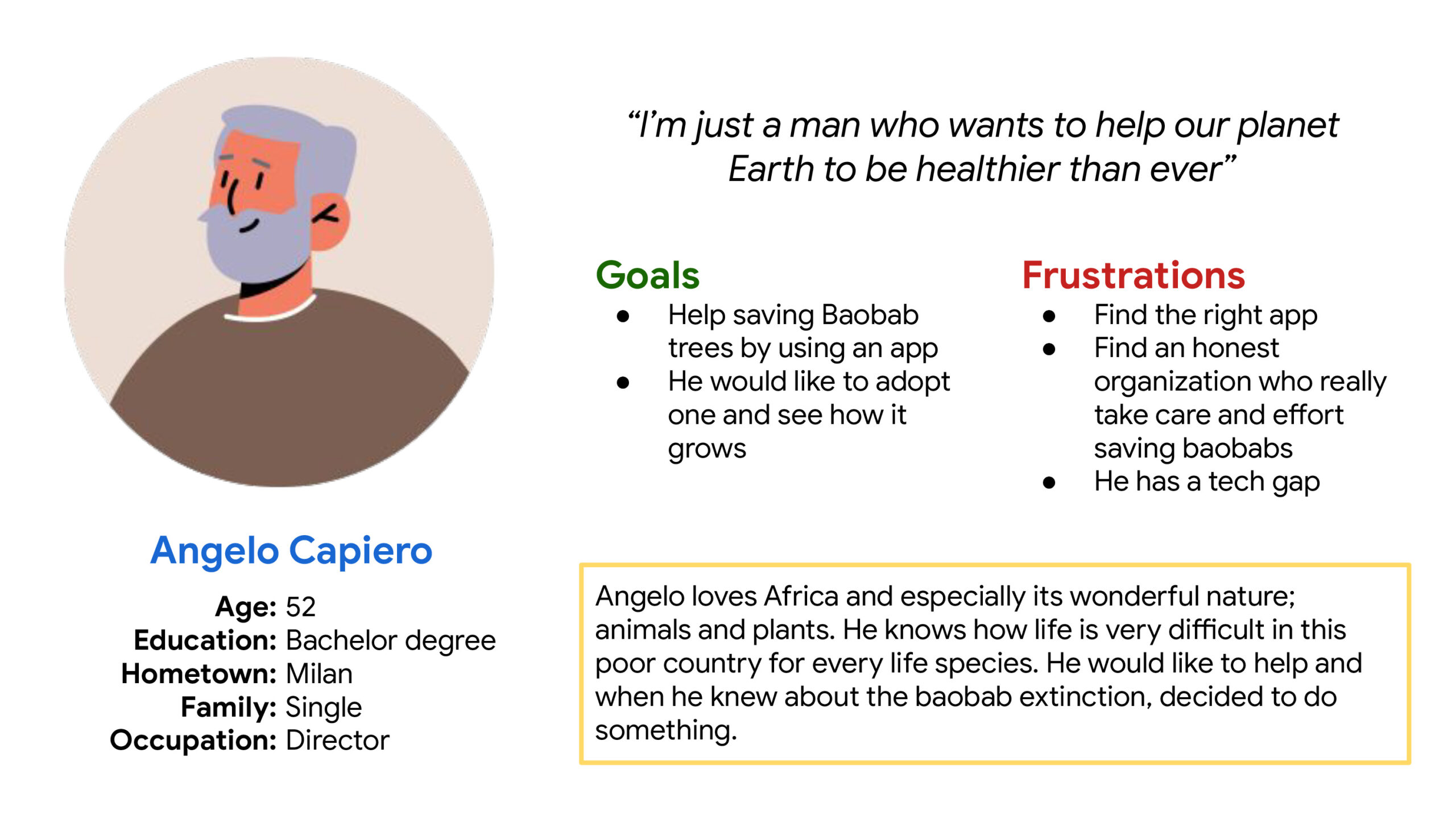
Angelo Capiero

Problem statement:

Angelo is a director of an hotel in Milan, Italym who needs to feel better helping to save baobabs from extinction because he was in Africa and he loves them.

Akiko Teruo

Problem statement:

Akiko is a widow and mother of 2 children who need to help save some species from extinction because she wants to educate her sons to respect nature.

Competitive audit

The goal of this audit was to understand how other competitors try to collect donations, how they help the user to do it without issues and how we can improve the user experience.
Simplifying the donation and adoption process was the main goal.

Ideation

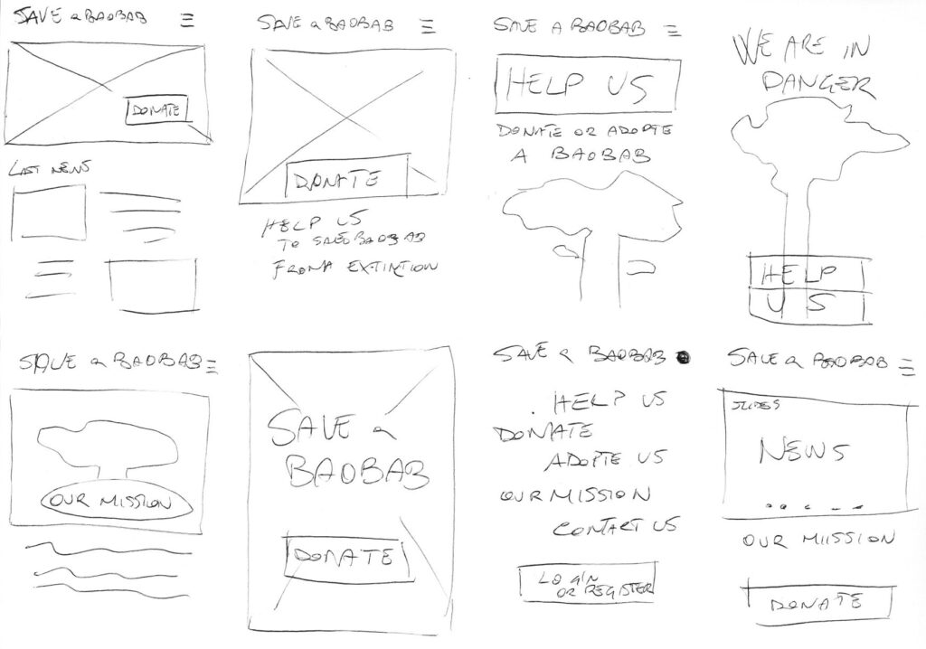
With the crazy eights method, I tried to figure out how to arrange the main elements on the homepage of the app.
The donate button was at the top of the priority list.

User flow map

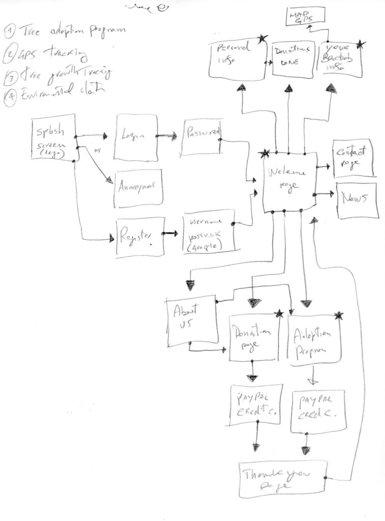
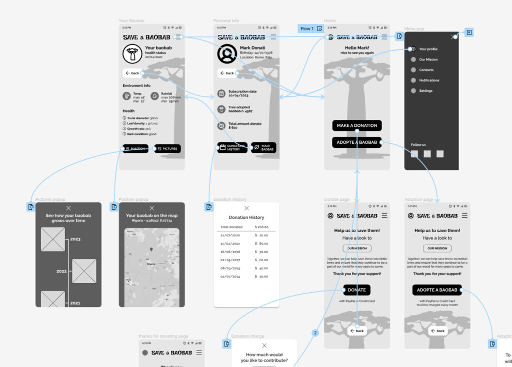
First I started creating a user flow map trying to figure out how the user could navigate the app.

Thanks to this, I found out that I could implement useful things like GPS tracking for adopted trees and health information about them.

Preliminary paper wireframes

Before to start designing on Figma I
preferred to sketch some ideas on paper.

I found different ways to put in evidence the main goals of the app: donations to the project and tree adoptions.

Low fidelity wireframes

1 – I started to design the homepage of the app putting in evidence the Donations and the Adopt button.
On the top, a welcome message to the registered user.

2 – The personal page has to contain all the info about donations and adoption.
I included also a “back” button to simplify the user flow.

3 – The page of the adopted
baobab had to contain all info about the environment where it grows up and info about its health status.

I also included a button for the GPS position page and a button for the picture gallery history of the tree.

Low fidelity prototype

The main goal of this prototype was to test if was easy or not for a user to complete the donation or
the adoption process.

And to test if all the info about the adopted tree were clear to find and understand.

First Usability study

Research goal: understand if is easy to donate or adopt a baobab with the app and if personal and tree info are easy to consult.

Research questions:

  • Is it easy to donate?
  • Is easy to adopt a baobab?
  • Are there issues to understand info about tree?
  • Are there any parts where users are getting stuck?

KPI’s:

  • Time on task: to check how is easy to donate or adopt a baobab
  • Drop-off rate: to check if there are any parts where users get stuck
  • Conversion rate:  to check if users are able to donate or adopt

Study type

Moderated live interviews

Partecipants

Two males, two females, and one person with disabilities between the ages of 20 and 50.
Two participants are persons who don’t speak english.

Location

Rome. In a quiet room.

Lenght

1 day

Results

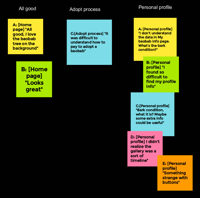
After the usability study, I found out that find the personal info page was not easy find, enviroment and other info about tree were not easy to understand and that a better iconography should help to use the app.

Here is my affinity diagram where is easy to observe that:

  1. Users want to easily donate
  2. Users want to easily adopt a baobab
  3. Users want to understand the meaning of some info on the adopted tree page
  4. Users want to find out how to change personal info

Low fidelity prototype 2

Basing on the usability study I implemented iconography to give a better experience to the user.

I also included the possibility to click on the tree’s info to let the user understand what is reading.

Mock-up

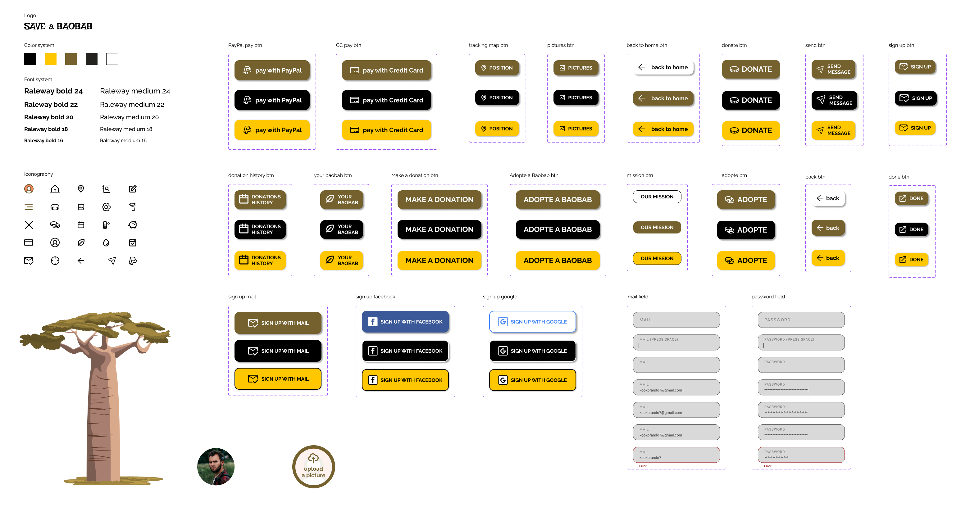
Save a Baobab app sticker sheet

Time to make the first mockup.

I set the 3 primary colours.

I applied the 60-30-10 rule for colors.

60% with Orange (#E98B1C)
I used it for the background.

30% with Green (#74612E)
For main buttons.

10% with Black (#00000)
For page titles, call to actions, brand identity and body.

2 types of font. Raleway bold for titles and Raleway medium for body and placeholders.

Choose a set of icons for menus, buttons and forms.

Choose the the style for buttons and input areas.
Second Usability study

Research goal: understand if the app now solves the issue it has before and check if there are new things to be fixed or improved.

Research questions:

  • Is it easy to donate or adopt?
  • Is it easy to find personal info?
  • Is the meaning of the tree’s info clear now?
  • Is the Gallery understandable?
  • Are there any parts where users are getting stuck?

KPI’s:

  • Time on task: to check how is easy to donate or adopt and how long it takes
  • System usability scale: to check if the design can be improved
  • Conversion rate:  to check if users are able to donate or adopt

Study type

Moderated live interviews

Partecipants

Two males, two females, and one person with disabilities between the ages of 20 and 50.
Two participants are persons who don’t speak English.

Location

Rome. In a quiet room.

Lenght

1 day

Results

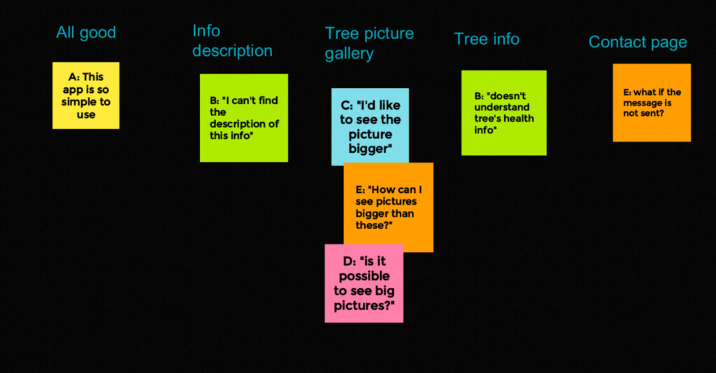
After the usability study, I found out that some participants would like to see gallery pictures bigger and someone still doesn’t understand tree’s health info.

So I decided to implement a pop-up for each picture of the gallery to see them bigger and popups for each health info to explain, with a simple description, the meaning of that info.

The SUS questions reported that all the information and, in general, the design is clear and easy to use.

High-fidelity prototype

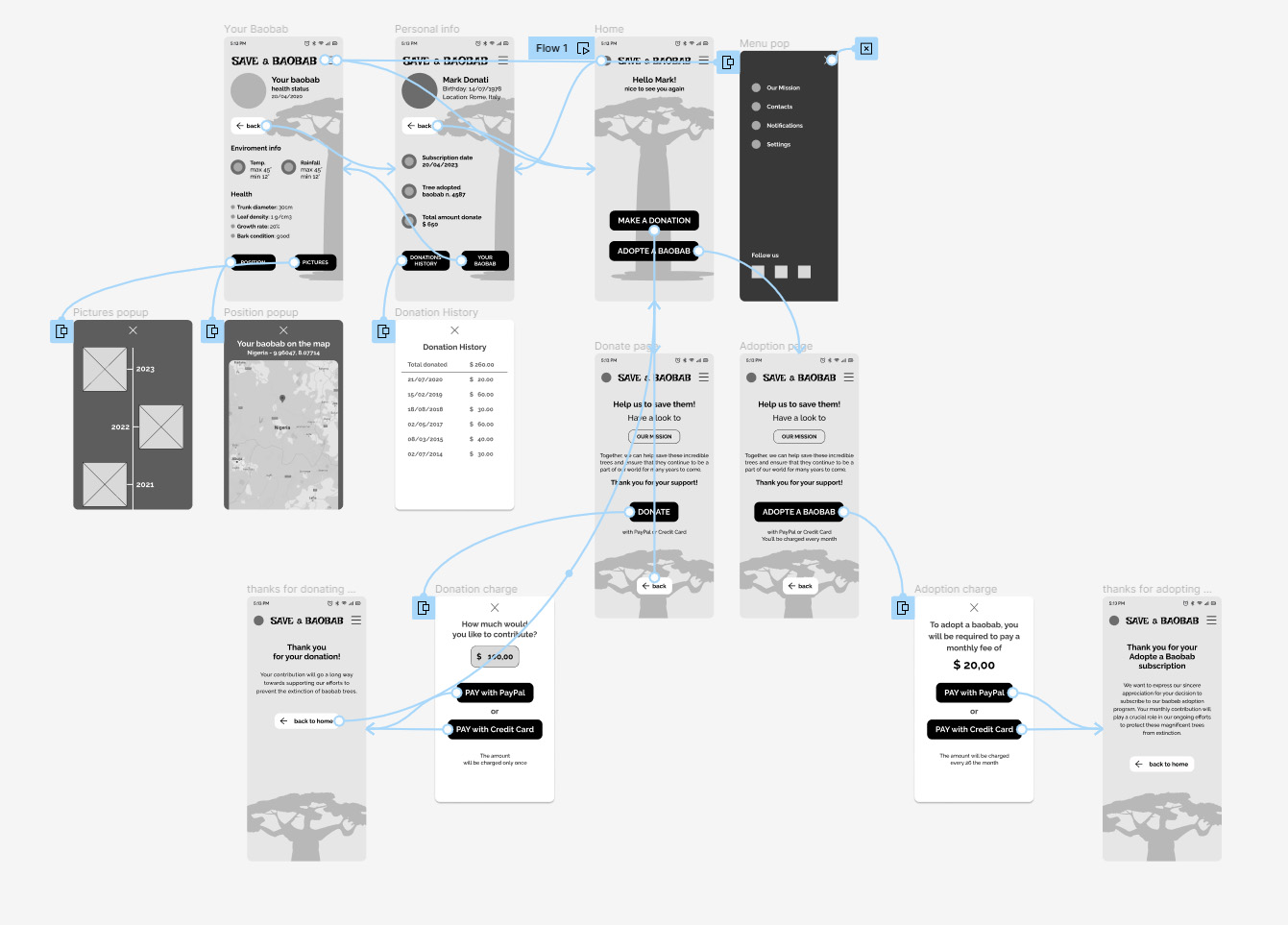
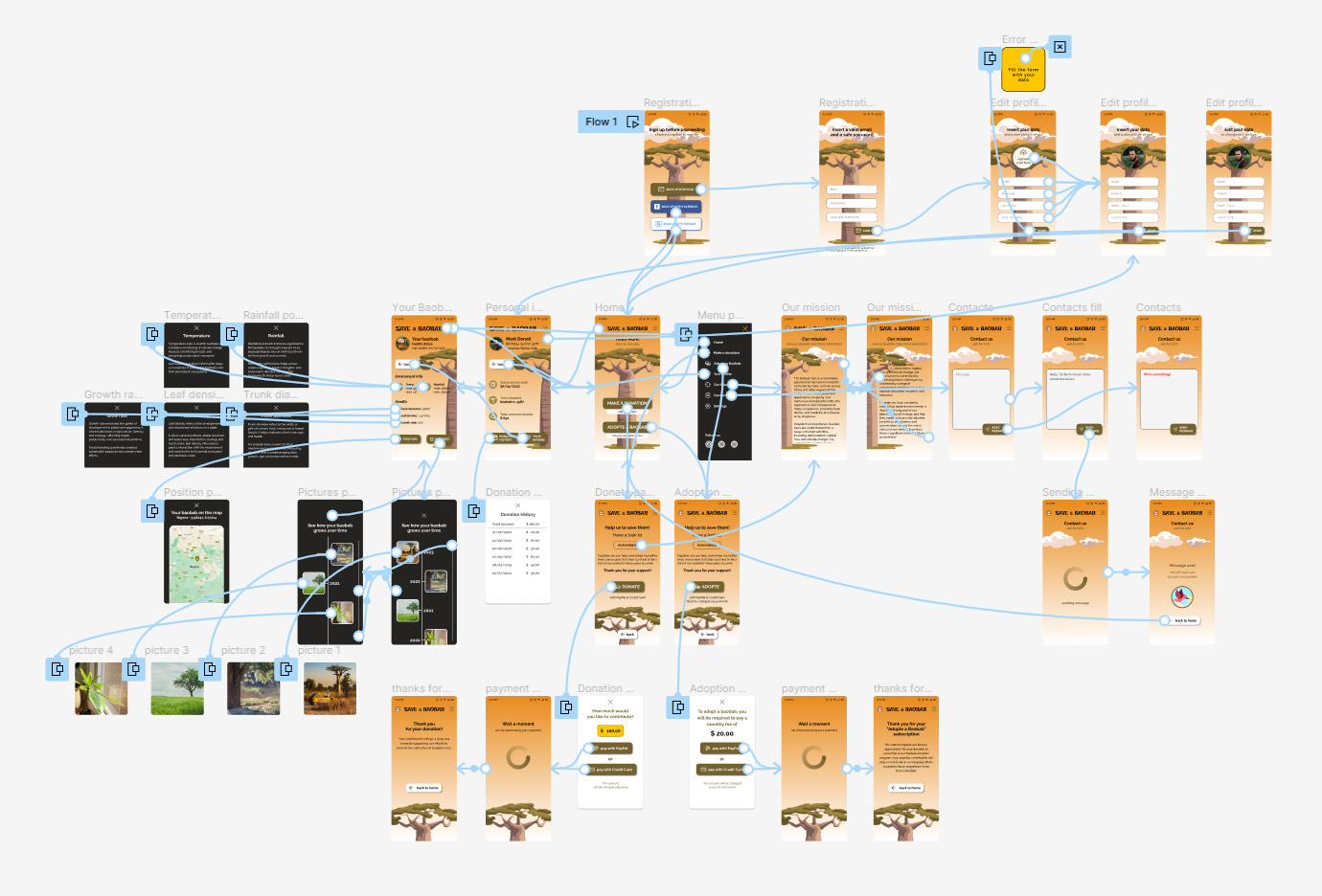
In the hi-fi prototype, I included all the possible user choices and optimize the flow based on a third usability test.
In this case, I also provided to design the signup and the sign-in process.

You can see and try the navigable prototype on Figma.

Responsive website

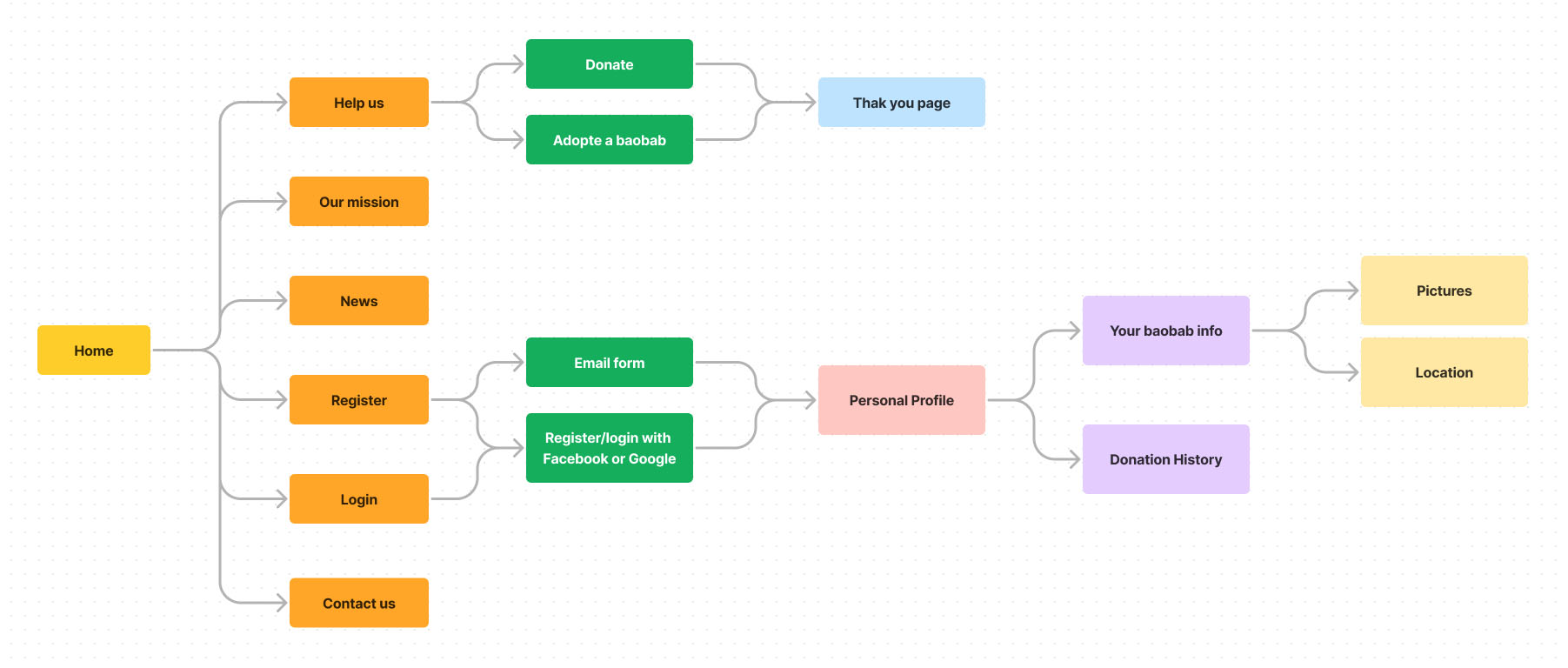
Website sitemap

For the responsive website, the goal was to maintain the same consistency of the app adding some new features for the different devices, like the news section.

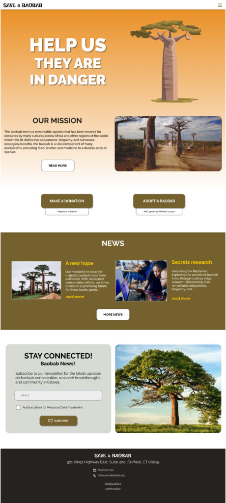
Responsive designs

The website version of the app should be visible and efficient over all devices.
I tried to maintain the same consistency of the app giving accent on the main goals: donations and adoptions.

mobile version

home mobile

tablet version

home tablet

desktop version

home desktop

Takeaways

Impact

Users praise the app and website for their user-friendly design, making donations or adopting baobabs effortlessly achievable.

They also note that it instils a sense of empowerment, making environmental contributions accessible to all.

What I learned

Working for social good was special. I felt so helpful with this project. I would love to work on similar purposes in the future.

I learned how demanding is to design apps and responsive websites, and at the same time, how is satisfying.

Next steps

1

Research how successful the app is in reaching the goal of saving baobabs.

2

Implementing more languages to let more users around the world help these wonderful trees.

3

Give some rewards to the best users to give others an example to follow.