
PROJECT: MyFancyRestaurant app
ROLE: Visual, Research, UX Design
DURATION: Feb – Apr 2022
Project vision
MyFancyRestaurant is a restaurant in Turin, Italy, that offers a unique atmosphere to its customers.
The project is to design an app that is able to help its customers easily book a table and consult the menu without having to interact with the local staff.
An app that is multilingual, easy to use even for people with disabilities.
The problem
- Book a table is not easy for everybody especially when they don’t have to time to spend of they don’t know the local language to call directly the restaurant.
- Is also important to inform people about food ingredients cause some of them can be allergic or have intolerances
The goal
- Book easly and efficiently tables
- Inform clients about menu ingredients
- Be inclusive for every people
- Give the chance to book also a parking place
Role and responsabilities
In this project my role was UX designer and researcher.
My responsabilities were…
Conduct:
- usability studies
- insights
- accessibility studies
Write down:
- empathy maps
- personas
- journey map
- personal and hypothesis statements
Design:
- paper wireframes
- digital wireframes
- low-fidelity prototypes
- mockups
- high-fidelity prototype
Understanding the user
I have conducted interviews with potential clients chosen on the basis of gender, interests and disabilities.
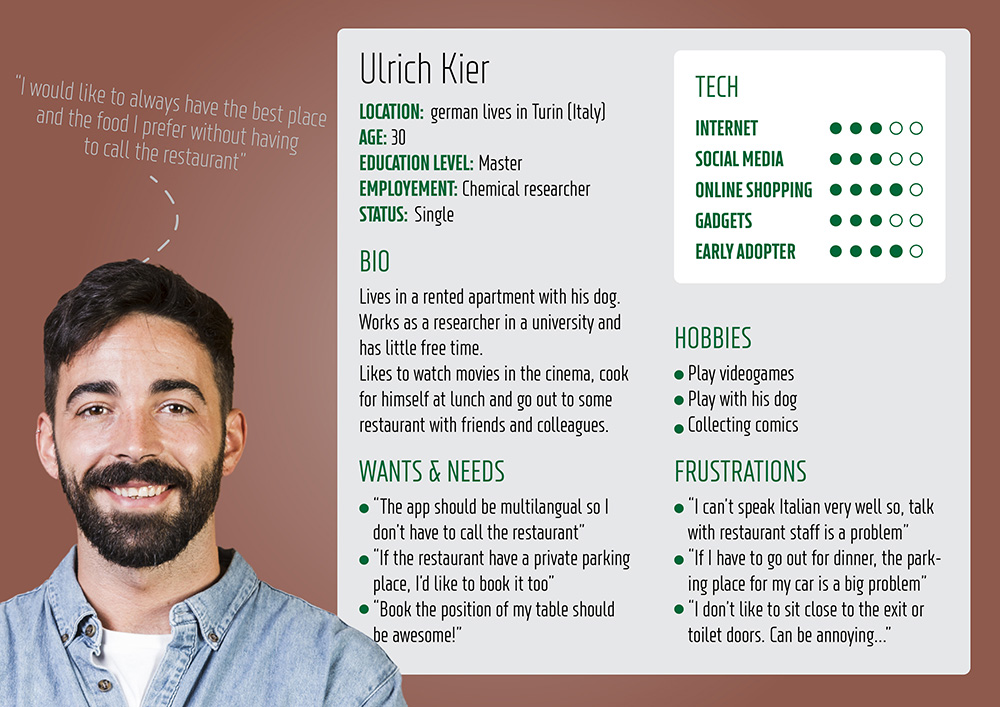
From the interviews it emerged that when it comes to booking a table at a restaurant many of them have problems doing it directly over the phone due to the shortage of time available and language barriers. For some then there is the need to consult the restaurant menu first to avoid problems with their intolerances to certain foods.
All these problems could be solved by an app that allows its users to be adequately informed and helps them book a table in a restaurant efficiently and quickly.
Pain points
- App efficiency:
The app should be easy to use with clear design. - Menu ingredients:
The app should offer the possibility to check the menu ingredients before booking the table. - Language:
The restaurant is located in the city of Turin and the staff speaks mostly Italian so the same people maybe more comfortable booking from the app if we implement different languages. - Accesibility:
Some people may have some disabilities so is important to inform about the restaurant accessibility and offer the chance to book the parking place and to add a form for special requests in the app
Personas
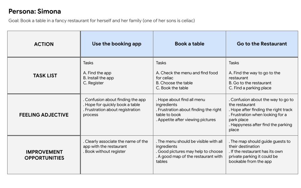
Simona Arcuri
Problem statement:

Journey map:
Ulrich Kier
Problem statement:
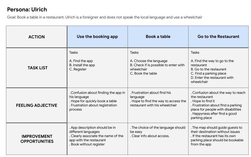
Journey map:
He wants to book a table but is stranger and don’t want to call the restaurant cause doesn’t know italian.
He also would like to book a parking place cause he have a disability and can’t walk without his wheelchair.
Lo-fi Ideation
Working through a couple of really preliminary sketches, I realized some of the ideas and layouts that I was thinking of just wouldn’t work.
With this, I was able to quickly filter the good and bad ideas out.
Preliminary Wireframes
I tried to figure out how to be as inclusive as possible without sacrificing usability.
In agreement with the stakeholders, I added the possibility to change the language, and choose the area of the restaurant where to book the table and the parking space in case there are free spaces.
I introduced some simple interactions between the various pages in order to be able to tackle the first usability study.
First Usability study
Research goal: understand if the app can bring advantages in terms of speed and ease of booking a table and if is enough inclusive.
Research questions:
- Is it easy to reserve a table?
- Is easy to change the language of the app?
- Are there any parts where users are getting stuck?
KPI’s:
- Time on task: to check how is easy to reserve a table and how long it takes
- Drop-off rate: to check if there are any parts where users get stuck
- Conversion rate: to check if users are able to reserve a table
Study type
Moderated live interviews
Partecipants
Two males, two females, and one person with disabilities between the ages of 20 and 50.
Two participants are persons who don’t speak Italian.
Location
Rome. In a quiet room.
Lenght
1 day
Results
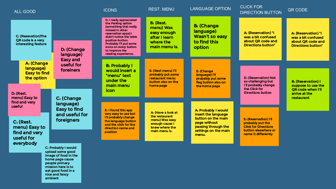
After the usability study, I found out that booking a table and consulting the restaurant menu is not so easy and some features are not so clear.
Here is my affinity diagram where is easy to observe that:
- Users want to easily book a table
- Users want to understand the purpose of QR code
- Users want to understand the purpose of the “click for directions” button
- Users want to find out how to change easily the app language
- Users want to consult the restaurant menu in an easier way
Insights and solutions
Worked on the home page and introduced a language button instead of the profile button so that choosing the language now should be easier.
Introduced a Restaurant Menu button under the hero image to easily consult the menu page.
I’ve made some changes to the QR code page and introduced a short explanation of how to use the code.
Also introduced a brief explanation of what the purpose of the “Directions” button is.
I added more negative space on every page, and choose better fonts and icons to improve the readability.
Mock-up
Time to make the first mockup.
I set the 3 primary colours in part picked from the logo.
I applied the 60-30-10 rule for colors.
60% with Grey (#434343)
I used it for body and some text and backgrounds.
30% with Beige (#AB9B8F)
For some background like a divider and for some secondary button.
10% with Red (#A52525)
For page titles, call to actions, brand identity and to drive attention on important buttons.
2 type of fonts. Saira condesed for titles and Roboto for body and placeholders.
Choose a set of icons for menus, buttons and forms.
Choose the the style for buttons and input areas.
Second Usability study
Research goal: understand if the app now solves the issue it has before and check if there are new things to be fixed or improved.
Research questions:
- Is it easy to reserve a table?
- Is easy to change the language of the app?
- Is the purpose of the QR code clear now?
- Is the “Directions” button purpose now clear?
- SUS questions
- Are there any parts where users are getting stuck?
KPI’s:
- Time on task: to check how is easy to reserve a table and how long it takes
- System usability scale: to check if the design can be improved
- Conversion rate: to check if users are able to reserve a table
Study type
Moderated live interviews
Partecipants
Two males, two females, and one person with disabilities between the ages of 20 and 50.
Two participants are persons who don’t speak Italian.
Location
Rome. In a quiet room.
Lenght
1 day
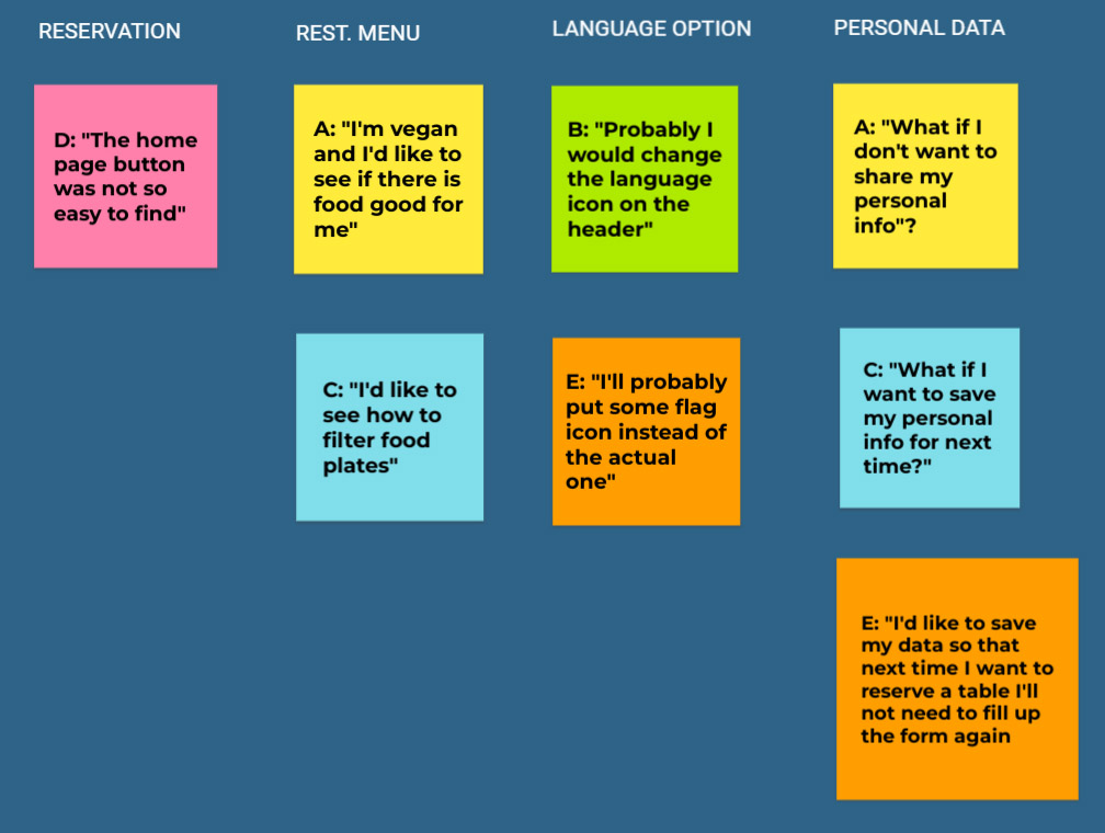
Results
After the usability study, I found out that some participants would like to see how filters work on the restaurant menu page but, more important, three of five participants noticed that there is no way to save their own data after filling out the reservation form.
So I decided to implement a pop-up that will ask if the customer wants to save his data for next time.
Then I’ll include the filter design in the interactive prototype.
The SUS questions reported that all the information and, in general, the design is clear and easy to use.
Final design
